Please note: this feature is only available in AppColl Plus. Click here for pricing and details on the plus features.
The Advance Graphical Reporting feature in AppColl allows you to understand and manage your business more effectively. You can generate customizable line, bar and pie charts aggregating your data in complex ways. For example, you can see a report of the average amount billed per matter for each patent type in each country. You could also generate a chart showing how the time between patent filing and issuing changes over time.
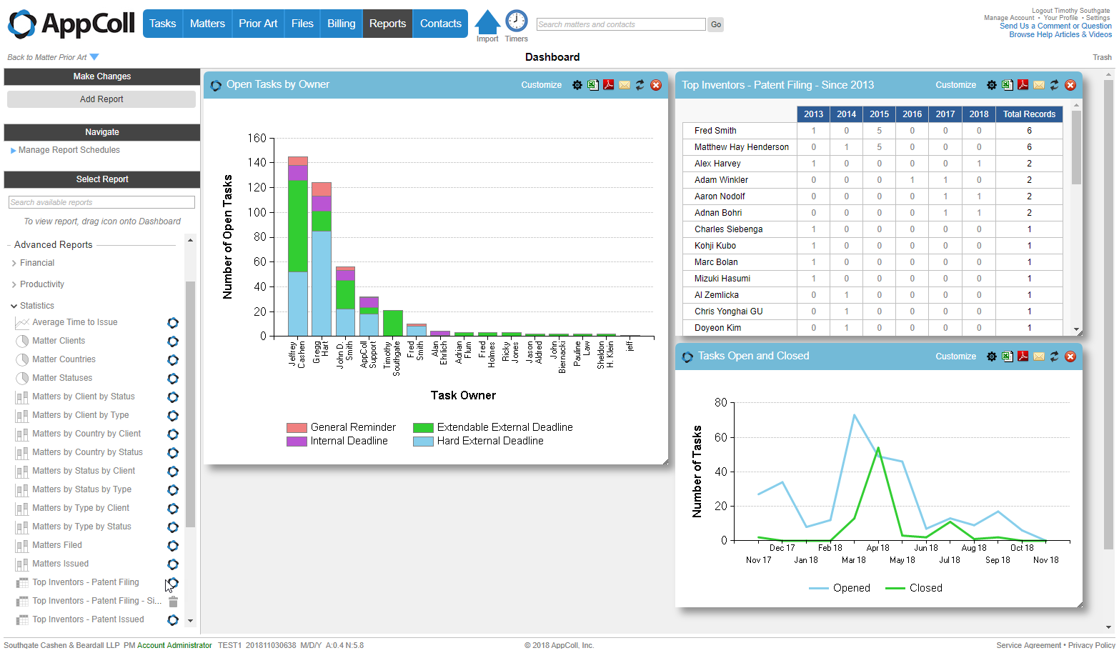
Graphical reports are displayed on a dashboard, where you can drag, drop and resize charts to display the information most important to you when you log in.
As with all other reports in AppColl, advanced reports can also be scheduled to be emailed to interested parties at regular times.
AppColl provides many standard advanced reports that can be easily customized to meet your specific needs.
Enabling Advanced Reports
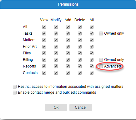
AppColl’s Advance Reports are available if your current subscription plan is AppColl PM Plus. For users that are not account administrators, you may have to update their Contact permission settings to allow access. If advanced reporting is not enabled, the user's report module looks the same as before the PM Plus upgrade.
Types of Reports
With advanced reports enabled, there are two types of reports available.
- Module Reports, created by adding filters in a module and saving a report from that page. These reports consist of simple tables of records with specific columns shown.
- Advanced Reports, created exclusively from the Dashboard page, are graphical reports resulting from more complex analysis of information in your account. The primary method of creating an advance report is to customize one of the many standard reports provided.
Account administrators can create an advance report "from scratch" using the expert settings page, but this is a relatively complex task. Please contact AppColl support for more information.
Displaying a Report
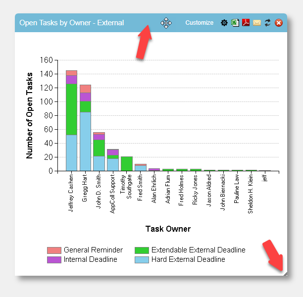
To view a report, find it from the Select Report section of the page on the left, put your mouse over the report/chart type icon on the left and drag it onto the right hand side of the page. After a report is on the dashboard page it can be moved and resized by dragging the header and bottom right corner respectively. Chart graphics and text automatically resize according to the window dimensions and size. The position and size of reports displayed in the dashboard is remembered on a per-user basis. When dragging reports, the size of the report will change to fill the available space, making it easy to build a dashboard consisting of multiple reports. When resizing the dashboard, the size of reports will automatically adjust (within limits) to keep the same amount of information shown in the dashboard.
Users can also select a single report to be shown in full-screen view by clicking on the report name itself, instead of dragging and dropping from the report icon.
Report Window Icons
There are several icons in the header bar of the report window.
- The AppColl logo on the left indicates that the report is a standard report.
- The Customize link is used to modify the report.
- The gear icon is used to open the expert settings page for a report (account admins only).
- The Excel icon downloads a CSV of the data in this report.
- The PDF icon generates a PDF of the report.
- The mail icons allows you to quickly email this report to someone in PDF or CSV format.
- The recycle icon re-runs the report and displays results for the current information. Reports are not updated automatically if underlying data changes.
- The dashed-box icon is used to show the report "full-screen", filling the entire dashboard.
- The white x in a red circle closes the report window. It does not delete the report itself.
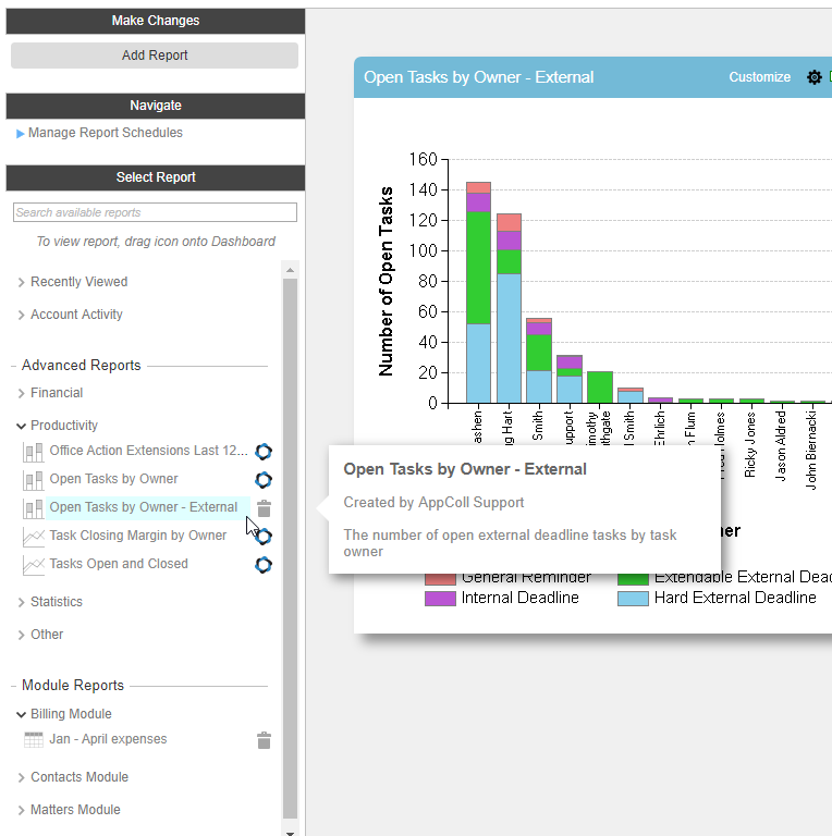
Selecting Reports
To find a report, you can either search for a report by typing text into the Search available reports box or browse the list. In the list the reports are grouped into categories, as indicated by a > in front of the name. Clicking on the > expands the category to show all reports in that category. Hovering over a report name shows more details about the report.
- Recently Viewed - Lists the reports you viewed most recently, newest at the top, regardless of type.
- Account Activity - List all built-in reports for showing user activity in your account.
- Advanced Reports - This section contains all advanced reports. The categories in this section vary depending on the reports and are specified using the expert settings page for the report. Contact AppColl support for more information.
- Module Reports - This section shows all module reports, with one category for each module with saved reports.
Deleting Reports
To delete a report, simply click on the trash can icon next to the report name.
Standard Reports
AppColl provides many standard reports for analyzing your information. In the list, these are shown with a small AppColl logo  on the right hand side. Standard Reports cannot be modified or deleted, But they can be copied and customized to make new reports that meet your needs - see below.
Copying and/or Customizing a Report
Reports are modified or copied by clicking on the Customize link at the top of the report window in the dashboard.
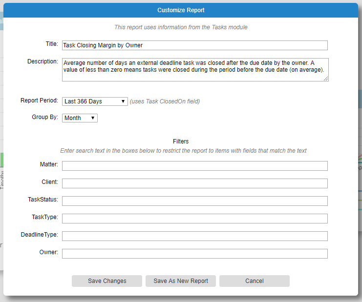
Note that the fields and controls will vary depending on the report and the current user's permissions. For example, if you are customizing a standard report the Save Changes button will not be present.
After making changes, click on the Save Changes button to update the current report. Click on the Save As New Report to copy this report and create a new one with your customization (leaving the current report unchanged). You must change the title if you wish to save a new report.
You can change the title of the report and the report description (that shows in the popup when hovering over the report in the left on the left).
For some reports you can change the time period for the data in the report, and how the periods are groups.
In the filters section, you can limit the data used for the report by typing text in the text boxes next to the fields names. Only records with fields that match the corresponding text will be used to generate the report.
Filter Text Syntax
The text entered can be a simple list of terms or a more complex Boolean expression. Searches are always case insensitive.
The following Boolean operators are supported in order of precedence:
| NOT cat | Match if cat is NOT present |
| cat AND dog | Match if BOTH cat and dog are both present in any order |
| cat OR dog | Match if either cat or dog are present |
Note that if no operator exists between two terms AND is assumed. For example, cat dog is processed the same as cat AND dog.
You can change the operator precedence (the order in which they are evaluated) by using parentheses.
The following table shows examples of search text matched to a field that contains:
| Search Text | Match? |
| fox | Yes |
| fox dog | Yes |
| dog fox | Yes |
| rabbit OR dog | Yes |
| NOT rabbit | Yes |
| (quick OR rat) AND (cat OR dog) | Yes |
| rabbit dog | No |
| quick OR rat AND Cat OR dog | No |
| fox AND NOT dog | No |